Disability is represented differently depending on which media you're looking at, in this analysis I will be examining a written and visual form of media and looking at how disabled people are shown in them.
Written Media (magazine)
 This magazine shows a Paralympian setting a record during the games, the image shows a disabled athlete celebrating her victory of setting a new record during the rain in the Paralympic games and as the guideline suggests she may have also overcome a personal goal, she is also shown as dignified which contrasts to some common forms of media which use them as either comedic devices or forms of tragedy.
The layout of the magazine allows for the main image to be the centre focus of attention for the cover and for the footer and guidelines to be noticeable but not detract from the main part off the magazine, however the Paralympian is still presented in a good and dignified way.
Some of the mis-en-scene in the photo does show the fact that the woman is disabled but also helps to emphasise the guideline article but there is also a lack of other athletes or audience which may show that even though they've accomplished some great things there may be some resounding feelings of isolation.
Visual Forms
This advert further supports the view that more people are becoming accepting of people with disabilities and almost reject films such as "Freak Show" where people were mocked for their disabilities, the camera has pan rounds which affect how the audience views the target but the angles that are chosen make them appear to be on a superior position because there's a lot of low based camera angles which usually show dominance or power which could be implied because of how they manage their disabilities and life. Audio in this is a mix of diegetic and non-diegetic sound with positive upbeat sound which allows for us to fell the same positivity that they do with society taking them seriously and treating them the same as we treat each other.


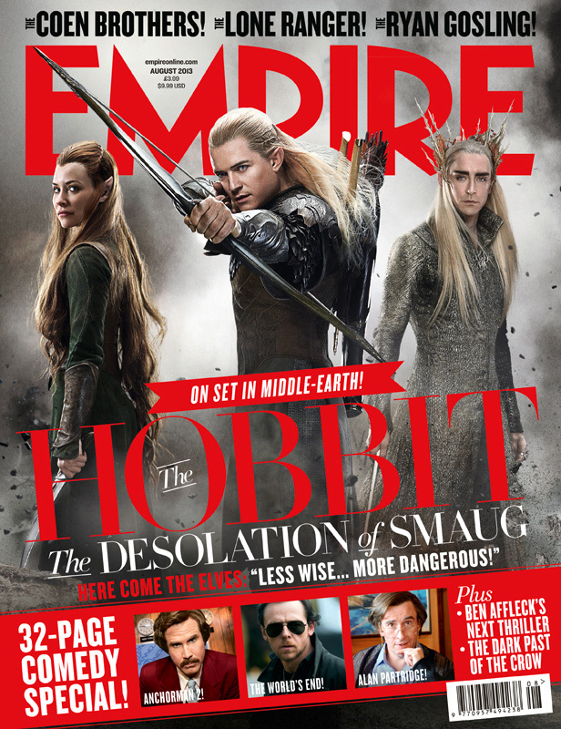 The page layout helps for the reader to identify what is covered in the magazine and help them to choose which articles they will want to read. The lettering of the magazine is standout which will attract attention from the intended audience so that they then pick it up and read it, by having big letters with a bright standout font and colour it will get more people's attention increasing sales and popularity within its audiences. By also having the main image of the article and the masthead it gives a clear indication to the main subject further helps the audience to determine whether or not they actually want the magazine, as if it's based around a topic that they don't find interesting then it won't be purchased. Then having limited information and smaller pieces of other articles and cover lines provides an enigma code as to what is said about the topics making us want to pick it up and read it to find out.