Lord Of The Rings: The Fellowship Of The Ring
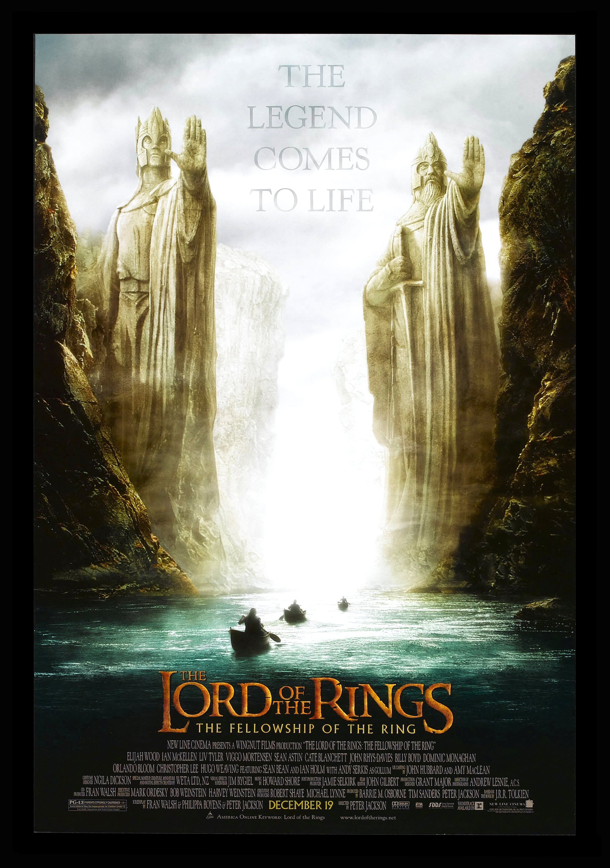 This Poster draws the attention of it's intended audience in many ways. One of these is by having large bold text for both the heading, this causes any passers by to stop and look back at it so they can see more information about the film. One form of this boldness is the bright colours used for the key pieces of information i.e. the release date and the title in order for this to be emphasised. There is a similar kind of large text in the background of the image which provides more intrigue for the viewer, however this is in a more transparent style which the audience can infer that it's not a major point in promoting the film but is still required for it to gain the support it needs.
Another point is the placement of the shot for the poster, it's in an enclosed river with two large statues stood at what we assume is the exit. The formation of the cliffs and the statues create an almost 3D corridor effect, by having this the viewers eyes would seem to follow the river up or down to either one of the texts. It also helps to create an enigma code for the film as the exit of the river and the surrounding landscape are shrouded from view, this makes the audience have a want to find out.
The colour pallet of the poster also helps to draw audience attention to the poster as the colours from the scene may seem bright, it's actually quite dark which makes things like the two pieces of text at the top and bottom stand out as well as the characters travelling by boat. These 'figures' and the boats their in are blacked out which further creates an enigma code for the viewer as they'll want to know who they are. There's a bright white fog at the end of this corridor river which attracts attention of the eye's as it stands out compared to the rest of the setting making us wonder what is beyond, further emphasising the enigma codes already created.
The statues at the end of the river are giant and looming over the pass with hands raised as if to say 'stop', this creates a sense of power that the two had when they lived. Their posture and overall manner show they were striking individuals but also provide us with a want to find out who they were and why they held so much power. The position of the camera helps to create this imposing feeling further by having it at the same level as the river which helps to further create the sense of imposing power.
The Hobbit: Desolation Of Smaug (Empire Magazine)
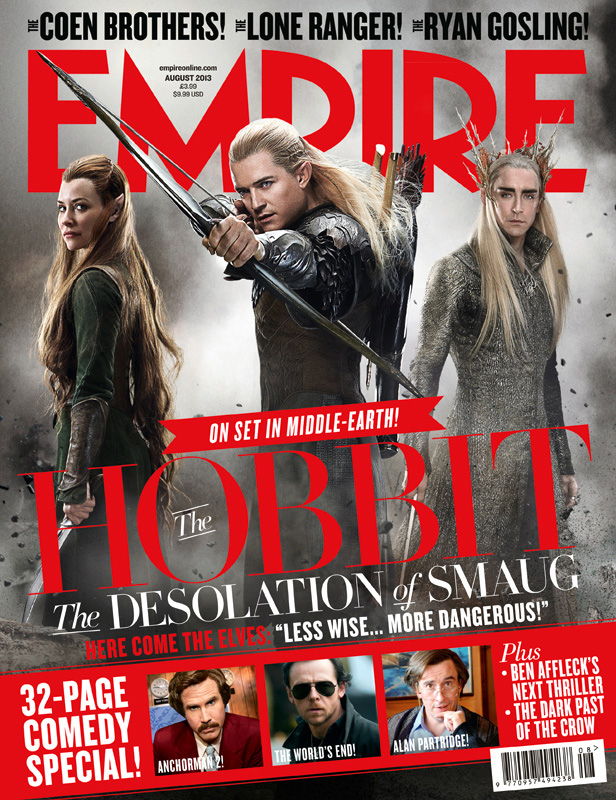 The page layout helps for the reader to identify what is covered in the magazine and help them to choose which articles they will want to read. The lettering of the magazine is standout which will attract attention from the intended audience so that they then pick it up and read it, by having big letters with a bright standout font and colour it will get more people's attention increasing sales and popularity within its audiences. By also having the main image of the article and the masthead it gives a clear indication to the main subject further helps the audience to determine whether or not they actually want the magazine, as if it's based around a topic that they don't find interesting then it won't be purchased. Then having limited information and smaller pieces of other articles and cover lines provides an enigma code as to what is said about the topics making us want to pick it up and read it to find out.
By using well-known celebrity names invites people to take a look as they'll want to find out what they have to do with the magazine and the articles contained in it, or if they are a fan of the celebrity it will cause them to buy it, further increasing their sales revenue.
No comments:
Post a Comment