Sunday, 12 May 2019

Magazine coursework Part 3

03/04/2019:

Due to a fault in my planning, I had to scrap the original idea and utilise plan B, which is to create a photography magazine, which means that I had to retake my cover photo and come up with new ideas in order to create this magazine.
This is an unforeseen issue and (at the time or writing this) I am trying to amend the issue as soon as possible.

Codes & Conventions:

Masthead-In large bold print with eye grabbing colours to get attention, picture of a camera with identification along with page reference to help readers get more information about  the available product.

Coverlines-Have small bits of info about what is contained inside of the magazine, the bold stand out colours help to define it from the background and helps to make the text more stand out.

Slogan-There is no discernible slogan on the front cover of the magazine however that does not mean that this particular company.

Price and Barcode-The price $5.99 helps us to determine that this type of magazine is of a higher quality than some others, the location of the barcode also helps us to determine the location of the pricing and the date that the magazine was published.

Cover Model-Objectified in a stereotypical way of how women are sexualised in the media, with the exposed legs and seductive pose in order to attract the typical male gaze in order to get men to buy the magazine, the similar objectification is shown in her face with indirect eye contact which shows that the viewer is the alpha also the makeup making her face appear ideal and attractive makes the male gaze more apparent.

The purpose of this magazine is to inform people about photography elements as well as helpful hints on how to make their photos better, it’s also designed to appeal to those who do photography as either a hobby or profession as they’ll be the target audience for this particular magazine but it can appeal to anyone. The demographic for this particular magazine are people who are either amateur photographers or for those who are just getting into it, and are looking for little tips and tricks from the articles in this magazine in order to help them improve it. However this is the targeted demographic, it can be targeted at people who like to look at and examine photographs that look good that have been taken by these in order to get inspiration or just for the pleasure of viewing the works.

The content that is usually contained in these kinds of magazines is usually informative, as it gives you the history of the photographs (like when they were taken, and what they are) and further in it’s giving tutorials almost, about how they can use photoshop in order to fix their images and make them look more appealing like those that are seen in the actual magazine itself.


In this double page spread we can see that there’s a lot of information around the three main images for the article, one of the bold subtitles is “Find a Background focus point” which means that this entire section of the article is based off giving hints and tips to amateur and hobby photographers to make sure that not only their works are good but that from these that they can have a sense of pride in the work that they have done.

This factor combined with the subtitle headings at the top of each page reinforce the point that the purpose of this magazine is to inform people about photography as well as offer good photos for people to look at whilst they read about how it was made. This means that this particular double page spread is designed to teach as we can observe by the subtitle headings to each paragraph.

There’s a small section in black which gives the reader advice on how to use the advice that the magazine has given and what to use in order to achieve this as well as offering some sample photos for the reader to see what to do and what to use in order to achieve this.

The spread layout of the  photographs on the double page spread helps to break up the images and for a better examination for examples of what the magazine can demonstrate and for them to be able to better connect what has been discussed inside the magazine in order for the audience to have a better experience with the magazine.


Evaluation of my magazine

 I  feel that the arrangement of the coverlines is good although the text on them has been stretched which has caused some disfigurement to them.

I’ll need to fix the text and colouring as well in order to make it more legible for readers.

The underneath of the main title still has a bit of difficulty to read against the colour of the bridge.

The transparency of the Canon camera’s background works well in order to not ruin the main cover image of the magazine.

The main cover image works as an attention grabbing image in order to sell copies, although it could have more of a model focus as typical of these magazines.

The front cover also needs the price, barcode and date on it as well in order to make it a better looking magazine and make it an official type as well.

With my double page spread the main image works well as a background although for a photography magazine there’s usually smaller images dotted around  the pages in order to provide a visual representation of what’s being discussed.


The second thing is the text, whilst there’s a good amount of it, there’s a certain amount of illegibility with the text on the right due to the choice in colouring for the text.

Also there’s a distinct lack in the page numbers, meaning that it’ll be difficult to navigate the magazine or for just trying to figure out where you are in the magazine.

Another missing element to the magazine and as is typical of these kinds of magazines, there’s usually some kind of faint title at the tops of the pages which would make it easier to identify where you are in the magazine.

The title for this section could be more bold and pronounced rather than how it’s currently, also the opacity could be changed to make it appear as though it is in thee sky rather than having it just as an in your face kind of style in the background.


The target audience of my photography magazine is amateur photographers aged 20 to 35, there is no specific gender to my magazine, the reason why I chose this age range is because this is the period of time where these people will be looking for a career or hobby and my magazine is designed to show this age grouping what photography is like as a career path. The purpose of my magazine is to educate people on what photography is like and how the audience can improve their images in order to get the most out of it. The genre of this magazine is lifestyle.


The double page spread was not appealing for the type of magazine I was aiming for, there is just a plain background with block text, this would not be satisfying to a reader because of the dull layout and lack of examples to the relevance of the article. I then began to re-make its structure by shrinking the background image to fit the left hand side of the page in order to be able to have more images of the style talked about in the article.

I also began to move the text and change its style in order to better suite what I had aimed for.

This change in structure also helped me to better style the magazine in a better format to make it more eye catching and more visually pleasing for the reader.

After re-working and bringing all the parts together here’s the end result of my second attempt and I am much more pleased with the result, it has clear division lines for the pint where the pages are joined together as well as clear and separated photos in order to maximise viewing pleasure.

The page numbers along with the magazine name help to make this magazine more identifiable compared to other competitors. The multiple photos help for the viewers to differentiate between the topics discussed.

Wednesday, 3 April 2019

Media Coursework Part 2

Email Correspondence


Across these days I tried to set up a photoshoot at my old school to see if the staff and pupils could help me in creating my front cover, at the time of writing I have made no progress in this area. In the emails I have tried to block any names mentioned (except form the last name of the correspondent) for their protection.

Thursday 14th March

I managed to arrange and attend a photoshoot for my magazine, this is the unedited first version so it will look a bit rough.


Friday 15th March

I began to look at ways to change and edit my front cover photo in order to make it more relevant to my magazine but also ways to make it more appealing to the eye.
Here are the images that I chose along with screenshots of where I got it from. 


Wednesday, 6 March 2019

Media Magazine Coursework Part 1


Friday 8th February:

I began to plan what kind of magazine I wanted to make and began to analyse others of a similar subject.

Here you can see my thought processes and mind mapping for what kind of magazine that I wanted to create:

There are lines going through branches to indicate that I did not like the idea and decided to eliminate it from my thought process.
Also on the left hand side of this plan you can see some basic thoughts and design looks for how I would want to style my front cover, this part of the process was a crucial part of the design process as this will determine who i will get looking at my magazine.
The right side of the plan also contains how I chose to breakdown the over-arching theme of 'Lifestyle'. I felt that creating a food magazine was an over used subject so I chose to go for one that doesn't get enough recognition 'Hobbies'. This then led me to branching out some subcategories such as 'War gaming', 'Video gaming' and 'Role-playing games'  out of these three I chose 'Role-playing games', the subject of my subcategory is 'Dungeons and Dragons' but while most of these kinds of magazines will cover what happens on the table, I hope to accomplish from real role-playing with a group to the life of the table in order for my readers to decide which type of this hobby they'd enjoy.
Below are some more traditional hobby magazines such as arts and crafts with models and photography:


Friday 8th February: On this day I also examined and broke down a magazine to try and help me get a better understanding of what kind of designs and themes ran through already existing magazines:
Here you can see a breakdown analysis of a magazine in the same theme of my subcategory, I also took note of how the cover of this particular magazine was created to attract peoples attention, not only in how the main cover image was made to draw attention from other magazines but also the unique layout compared to other magazines such as the title along the side of the cover and no coverlines.


Wednesday 13th February: On this day I carried on planning out what I was going to do for my magazine as well as analysing some more similar magazines.


This plan is to help me in trying to decide what to use when I'll make my front cover for my magazine, it also lists what materials I need for it.

It also helps me to plan out what I need to do in order to help with the creation of my front cover.


Wednesday, 28 November 2018

Disability represented in the media

Disability is represented differently depending on which media you're looking at, in this analysis I will be examining a written and visual form of media and looking at how disabled people are shown in them.

Written Media (magazine)

Image result for paralympics magazineThis magazine shows a Paralympian setting a record during the games, the image shows a disabled athlete celebrating her victory of setting a new record during the rain in the Paralympic games and as the guideline suggests she may have also overcome a personal goal, she is also shown as dignified which contrasts to some common forms of media which use them as either comedic devices or forms of tragedy.
The layout of the magazine allows for the main image to be the centre focus of attention for the cover and for the footer and guidelines to be noticeable but not detract from the main part off the magazine, however the Paralympian is still presented in a good and dignified way.
Some of the mis-en-scene in the photo does show the fact that the woman is disabled but also helps to emphasise the guideline article but there is also a lack of other athletes or audience which may show that even though they've accomplished some great things there may be some resounding feelings of isolation.

Visual Forms


This advert further supports the view that more people are becoming accepting of people with disabilities and almost reject films such as "Freak Show" where people were mocked for their disabilities, the camera has pan rounds which affect how the audience views the target but the angles that are chosen make them appear to be on a superior position because there's a lot of low based camera angles which usually show dominance or power which could be implied because of how they manage their disabilities and life. Audio in this is a mix of diegetic and non-diegetic sound with positive upbeat sound which allows for us to fell the same positivity that they do with society taking them seriously and treating them the same as we treat each other.   

Wednesday, 21 November 2018

Magazine Cover Analysis


Aim of a Magazine Cover:


To attract target audience
To engage reader by employing appropriate mode of address
To stand out from other magazines of similar genre
To suggest the subgenre of the magazine through the masthead, use of colours, content etc.
To engage the attention of the reader through the main image
To offer reasons for reader to buy the magazine through the cover lines
To convey an ideology to the target audience and sell the reader a lifestyle

These help a company to make and distribute their magazines, with these fundamentals these companies can plan for the design of their cover which gives them a specific target design to make which will appeal to their audience, however they do also have to make them appeal to the rest of the market customers which increases the companies popularity and fan base making them more prominent.


Male Representation in the media


Male representation


CW's Arrow

In the first episode during his training there's split lighting in his face which shows the split in the character, which highlights his split personality almost but also his double life when he shows his face in the day until he masks it at night. This lighting also shows his darker and more ruthless side, these ideas are emphasised further by his facial expression which has no emotion that makes him appear dominant and imposing in the video that shows us how much power he has. These elements help to reinforce the traditional stereotype of power and dominance that men typically have in the media.
However in this shot it shows Oliver (Stephen Amell) is shown to be weak, his facial expression shows the weakness to his character, this could be a sign of the internal struggle of his character from the context of the episode. The receding light and the shadow engulfing Oliver further emphasises the slow loss in his humanity which is further, this challenges the typical stereotype of men in the media as it almost shows the weakness of the character, when the stereotypical form of men is showing strength and dominance in many circumstances which means that this scene contrasts to the stereotype of men that is usually presented by the media.

Media text analysis of a film poster and magazine cover

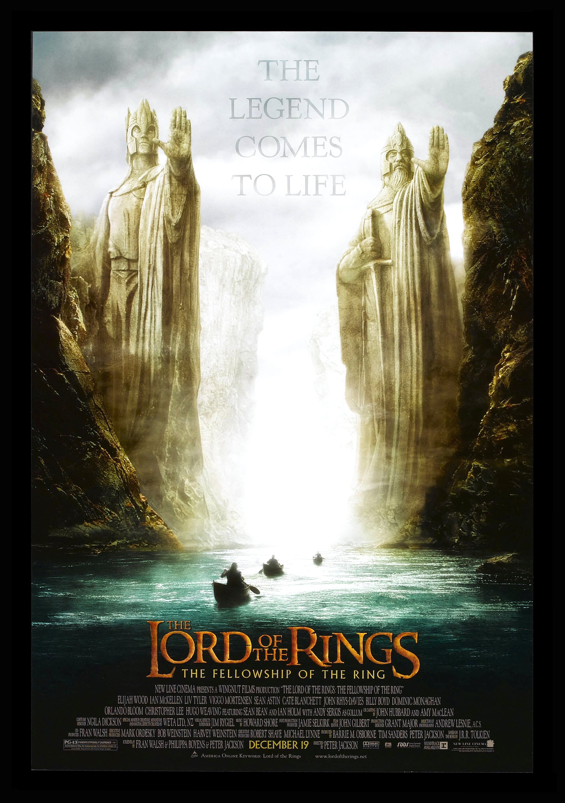
Lord Of The Rings: The Fellowship Of The Ring


Image result for lotr film posters This Poster draws the attention of it's intended audience in many ways. One of these is by having large bold text for both the heading, this causes any passers by to stop and look back at it so they can see more information about the film. One form of this boldness is the bright colours used for the key pieces of information i.e. the release date and the title in order for this to be emphasised. There is a similar kind of large text in the background of the image which provides more intrigue for the viewer, however this is in a more transparent style which the audience can infer that it's not a major point in promoting the film but is still required for it to gain the support it needs.
Another point is the placement of the shot for the poster, it's in an enclosed river with two large statues stood at what we assume is the exit. The formation of the cliffs and the statues create an almost 3D corridor effect, by having this the viewers eyes would seem to follow the river up or down to either one of the texts. It also helps to create an enigma code for the film as the exit of the river and the surrounding landscape are shrouded from view, this makes the audience have a want to find out. 
The colour pallet of the poster also helps to draw audience attention to the poster as the colours from the scene may seem bright, it's actually quite dark which makes things like the two pieces of text at the top and bottom stand out as well as the characters travelling by boat. These 'figures' and the boats their in are blacked out which further creates an enigma code for the viewer as they'll want to know who they are. There's a bright white fog at the end of this corridor river which attracts attention of the eye's as it stands out compared to the rest of the setting making us wonder what is beyond, further emphasising the enigma codes already created.
The statues at the end of the river are giant and looming over the pass with hands raised as if to say 'stop', this creates a sense of power that the two had when they lived. Their posture and overall manner show they were striking individuals but also provide us with a want to find out who they were and why they held so much power. The position of the camera helps to create this imposing feeling further by having it at the same level as the river which helps to further create the sense of imposing power.


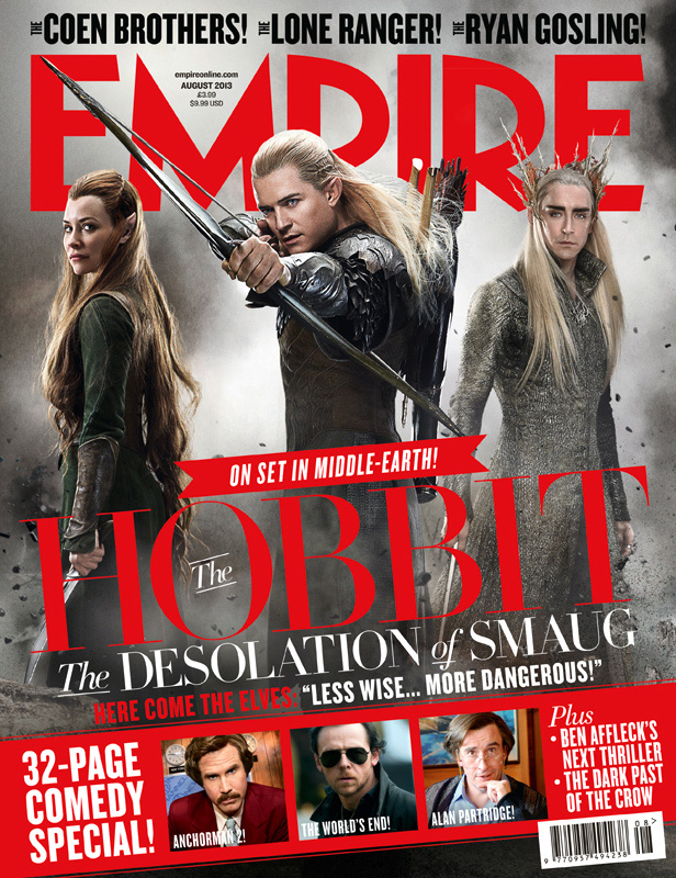
The Hobbit: Desolation Of Smaug (Empire Magazine)

Related image The page layout helps for the reader to identify what is covered in the magazine and help them to choose which articles they will want to read.  The lettering of the magazine is standout which will attract attention from the intended audience so that they then pick it up and read it, by having big letters with a bright standout font and colour it will get more people's attention increasing sales and popularity within its audiences. By also having the main image of the article and the masthead it gives a clear indication to the main subject further helps the audience to determine whether or not they actually want the magazine, as if it's based around a topic that they don't find interesting then it won't be purchased. Then having limited information and smaller pieces of other articles and cover lines provides an enigma code as to what is said about the topics making us want to pick it up and read it to find out.  
By using well-known celebrity names invites people to take a look as they'll want to find out what they have to do with the magazine and the articles contained in it, or if they are a fan of the celebrity it will cause them to buy it, further increasing their sales revenue.