Wednesday 28 November 2018

Disability represented in the media

Disability is represented differently depending on which media you're looking at, in this analysis I will be examining a written and visual form of media and looking at how disabled people are shown in them.

Written Media (magazine)

Image result for paralympics magazineThis magazine shows a Paralympian setting a record during the games, the image shows a disabled athlete celebrating her victory of setting a new record during the rain in the Paralympic games and as the guideline suggests she may have also overcome a personal goal, she is also shown as dignified which contrasts to some common forms of media which use them as either comedic devices or forms of tragedy.
The layout of the magazine allows for the main image to be the centre focus of attention for the cover and for the footer and guidelines to be noticeable but not detract from the main part off the magazine, however the Paralympian is still presented in a good and dignified way.
Some of the mis-en-scene in the photo does show the fact that the woman is disabled but also helps to emphasise the guideline article but there is also a lack of other athletes or audience which may show that even though they've accomplished some great things there may be some resounding feelings of isolation.

Visual Forms


This advert further supports the view that more people are becoming accepting of people with disabilities and almost reject films such as "Freak Show" where people were mocked for their disabilities, the camera has pan rounds which affect how the audience views the target but the angles that are chosen make them appear to be on a superior position because there's a lot of low based camera angles which usually show dominance or power which could be implied because of how they manage their disabilities and life. Audio in this is a mix of diegetic and non-diegetic sound with positive upbeat sound which allows for us to fell the same positivity that they do with society taking them seriously and treating them the same as we treat each other.   

Wednesday 21 November 2018

Magazine Cover Analysis


Aim of a Magazine Cover:


To attract target audience
To engage reader by employing appropriate mode of address
To stand out from other magazines of similar genre
To suggest the subgenre of the magazine through the masthead, use of colours, content etc.
To engage the attention of the reader through the main image
To offer reasons for reader to buy the magazine through the cover lines
To convey an ideology to the target audience and sell the reader a lifestyle

These help a company to make and distribute their magazines, with these fundamentals these companies can plan for the design of their cover which gives them a specific target design to make which will appeal to their audience, however they do also have to make them appeal to the rest of the market customers which increases the companies popularity and fan base making them more prominent.


Male Representation in the media


Male representation


CW's Arrow

In the first episode during his training there's split lighting in his face which shows the split in the character, which highlights his split personality almost but also his double life when he shows his face in the day until he masks it at night. This lighting also shows his darker and more ruthless side, these ideas are emphasised further by his facial expression which has no emotion that makes him appear dominant and imposing in the video that shows us how much power he has. These elements help to reinforce the traditional stereotype of power and dominance that men typically have in the media.
However in this shot it shows Oliver (Stephen Amell) is shown to be weak, his facial expression shows the weakness to his character, this could be a sign of the internal struggle of his character from the context of the episode. The receding light and the shadow engulfing Oliver further emphasises the slow loss in his humanity which is further, this challenges the typical stereotype of men in the media as it almost shows the weakness of the character, when the stereotypical form of men is showing strength and dominance in many circumstances which means that this scene contrasts to the stereotype of men that is usually presented by the media.

Media text analysis of a film poster and magazine cover

Lord Of The Rings: The Fellowship Of The Ring


Image result for lotr film posters This Poster draws the attention of it's intended audience in many ways. One of these is by having large bold text for both the heading, this causes any passers by to stop and look back at it so they can see more information about the film. One form of this boldness is the bright colours used for the key pieces of information i.e. the release date and the title in order for this to be emphasised. There is a similar kind of large text in the background of the image which provides more intrigue for the viewer, however this is in a more transparent style which the audience can infer that it's not a major point in promoting the film but is still required for it to gain the support it needs.
Another point is the placement of the shot for the poster, it's in an enclosed river with two large statues stood at what we assume is the exit. The formation of the cliffs and the statues create an almost 3D corridor effect, by having this the viewers eyes would seem to follow the river up or down to either one of the texts. It also helps to create an enigma code for the film as the exit of the river and the surrounding landscape are shrouded from view, this makes the audience have a want to find out. 
The colour pallet of the poster also helps to draw audience attention to the poster as the colours from the scene may seem bright, it's actually quite dark which makes things like the two pieces of text at the top and bottom stand out as well as the characters travelling by boat. These 'figures' and the boats their in are blacked out which further creates an enigma code for the viewer as they'll want to know who they are. There's a bright white fog at the end of this corridor river which attracts attention of the eye's as it stands out compared to the rest of the setting making us wonder what is beyond, further emphasising the enigma codes already created.
The statues at the end of the river are giant and looming over the pass with hands raised as if to say 'stop', this creates a sense of power that the two had when they lived. Their posture and overall manner show they were striking individuals but also provide us with a want to find out who they were and why they held so much power. The position of the camera helps to create this imposing feeling further by having it at the same level as the river which helps to further create the sense of imposing power.


The Hobbit: Desolation Of Smaug (Empire Magazine)

Related image 
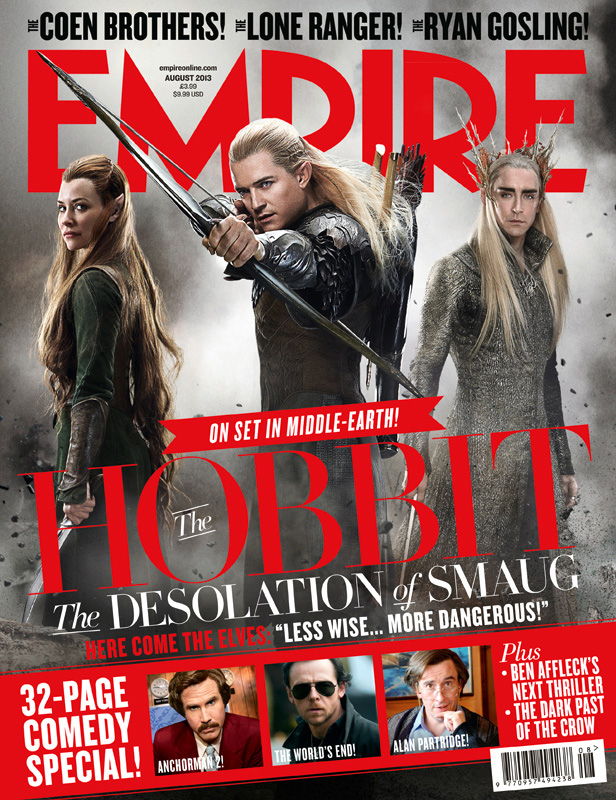
The page layout helps for the reader to identify what is covered in the magazine and help them to choose which articles they will want to read.  The lettering of the magazine is standout which will attract attention from the intended audience so that they then pick it up and read it, by having big letters with a bright standout font and colour it will get more people's attention increasing sales and popularity within its audiences. By also having the main image of the article and the masthead it gives a clear indication to the main subject further helps the audience to determine whether or not they actually want the magazine, as if it's based around a topic that they don't find interesting then it won't be purchased. Then having limited information and smaller pieces of other articles and cover lines provides an enigma code as to what is said about the topics making us want to pick it up and read it to find out.  
By using well-known celebrity names invites people to take a look as they'll want to find out what they have to do with the magazine and the articles contained in it, or if they are a fan of the celebrity it will cause them to buy it, further increasing their sales revenue.

Thursday 20 September 2018

Seven intro analysis

How are technical, audio and visual codes used in "Seven" to make it an effective thriller opening?


Audio Codes

The sequence begins with non-diegetic distorted music, which sets up that the rest of the film will be following this twisted format, but by also having no lyrics added until the very end adds to the build up of suspense as it's the same warped track repeated. This creates an enigma code for the audience as they don't yet know what has caused the music to sound almost corrupted which could be a connotation that the events that happen in this film are also of a corrupted disposition.


Visual Codes

There are lots of visual codes hat appear within this intro sequence but one that I felt was of note was the pen behind a piece of paper either being turned or used to block what the persons doing from view. The position of his hand that is being used could connote a couple of different meanings each of which have their own effect n the reader, one of these is that it's being used almost like a syringe to inject someone with (maybe a patient or abductee) which promotes a very dark and almost horror vibe, this further adds to the tension built up from the previous audio codes already presented.

There were multiple sharp props used within the sequence, such as needles and screws, which could promote something of a horror disposition as these could be instruments used for torture or by inmates, all of which adds to the increasing feeling of dread and tension created by all of these elements working alongside one another.


Technical Codes

There appears to be very limited camera movement and all the movements made are done by transitional jump cuts which could connote that instead of it  being an all rounder third person experience for the audience it instead closely follows the narrative of one of the inmates or subjects within this  building.

However the primary focus of the camera does appear to be the hands, this could mean that what ever the main themes are of the film, the hands of this doctor or psychoanalyst are a key part or role that is played in the film and the way that the camera follows this could mean that these are the hands of the main character in which case the audience is left with an Enigma Code as they don't know the purpose of the hands or why the camera is following them so intently

Sample: Daniel Blake


Exam Style Questions


Explain two ways that camerawork has been used to create meaning for the audience in I, Daniel Blake (4 Marks)

Camerawork changes and varies between whose in shot but it is primarily between medium shots and close ups, which bring us closer to the character of Daniel as he struggles and we become closer to him as a person and not just a character in a film, it also highlights and draws attention to his facial expressions which cause an emotional response within the audience. This camerawork further indicates that when a mother with two children comes into frame, the camera shot changes to a medium wide shot from the front of the woman which means that she is only a secondary character.

Another way in which that the camera changes is towards the end of the trailer when the camera switches to a long wide shot which puts both Blake and a random character into full view and the text spray painted on the wall behind them which could have some sibilance later on in the film rather than just the snippets we see.


Explain one way editing has been used to create meaning for the audience in I, Daniel Blake               (2 Marks)

The way the shots have been edited to include jump cuts brings more meaning to the trailer than if it was handed to us in one big helping or go, by jumping between shots so frequently it could connote the rapidity in which Blake's life has been moving throughout the film and by showing us this through jump cuts in the trailer it helps to add that little bit of creative meaning for the audience.


Explain two ways sound has been used to deliver meanings for the audience in I, Daniel Blake          (4 Marks)

Non diegetic sound is used in the beginning of the of the trailer as a high-pitched sound with some deeper tones, this type of audio is primarily used in media to describe someone's isolated feelings and combining this with the camerawork at the start of the trailer it provokes an emotional response form the audience as they'll either sympathise or empathise with his feeling of isolation and loss.

But as the trailer continues and Blake gets more and more confident in what he needs to do in order to succeed the music changes along with the tone of the film,  which promotes yet another emotional response from the audience as their mood  and attitude will change from feeling sorry for Blake to one of happiness that he's managing to be more than he thought he could be.


Sunday 9 September 2018

Task 2

This is the front cover of a magazine called The Technology Issue now while it has a very appealing front cover the top left corner does indicate that it's an airline passenger experience. This could mean that either:
A) This magazine is for airplane passengers to read during a flight which means that it will have a strong possibility of not being read.

B) This particular magazine is stocked at concession shops at the gates, meaning that passengers may buy it to read on the plane then either take it home or leave it on the plane in the pocket of the seat in front.

C) This magazine is about some of the technological experiences that passengers go through when they use an airport.

However on a closer inspection of the magazine the purple text at thee bottom identifies the subjects talked about in the issue, which covers most of what normal people consider to be serious technological problem. It does also cover air travel but only from the perspective of ground control which means that while it make not give the view of passengers or any technological issues they deal with, it does cover a technology aspect of the profession.


Based off of this  double page spread towards the begin of the magazine it's safe to say that the most likely of the possibilities listed earlier B is the highest chance alongside A


This goes into more detail about technological advances in air travel across all planes as well as what those changes have brought that help people.


Overall based off what has been demonstrated I would say that this magazine is definitely an informative one and not one that's primarily used for entertainment, which means that instead of being used for people reading this for the purpose of shopping and general entertainment, it is used to almost teach people the advances in airline technology and how that helps us.

This second double page spread tells the history of how ground control in airports was made and how it continues to aid us today.


This fully confirms the fact that this magazine is more of an information and teaching one over a standard airport/plane. It has many appealing colours which attracts people to pick it up and read it, the layout of this magazine indicates the fact that all the facts are based in an easy to read format with pictures and different coloured text to help break up the fact absorption easier.

Part 2: Limitations of Print Magazine and the Opportunities of Digital Magazines

Now lets delve into what the limitations are for Print Magazines

  • Not everyone will be able to get a hold of them
  • Many places will still keep out of date magazines and keep the latest issues behind the older ones
  • If the target market is a global audience then this form of media is definitely not the most optimum, digital magazines have a much better coverage as they are stored on the world wide wireless network
  • Print media advertising is not the most time effective as they require a lot of time and planning
  •  Most of the advertisements may get lost within each other so it's difficult to get your certain advert to be distinguished
So the overall vibe that is given is that in today's modern era printed media is not the most optimum way to get a message out to large audiences, printed media doesn't have the best coverage for global audiences. However they do get much use from travel, such as shops that sell them in places like airports and train stations, where they can be left and other people can read them.

The opportunities for digital magazines are massive as they are online which means that anyone can access them at any time, this not only allows for global coverage meaning that many magazine  companies can stay in business for longer. It also allows for a diverse fan base that allows for better social interaction. Furthermore as many people have access to modern technology and the internet magazines now have more discernible adverts which boosts company coverage world wide.

I am now sure that based off the evidence that I've provided you now see that digital magazines have much better coverage than printed ones. 

Task 1


Image result for film posters 2018
In this film poster I think that both men and women are portrayed as having equal roles within the film, however there are some that appear to be in more of a position of power than others, this may signify the importance of the role that they have in the film.

Mark Hamill is the looming presence in the background which means that he'll play a significant part in the feature, also by having him in the background in the background means that he'll be a main part the over-arching story.

Next you have two other characters that are bold and in the foreground of the poster which means that they'll be linked to Mark Hamill (Luke Skywalker) and therefore play another important part in the story of the film. It also details the possibility of multiple protagonists as well as a main antagonist.

This use of media representation is used in a lot of other media for promotion of films, television and computer games. It helps to boost marketing as it draws your eyes to the items in the posters that really stick out  which then causes you to go and do research on the thing being advertised to the public.

Image result for video game posters 2018One example of this other than the one I've chosen is this Pacific Rim Uprising poster which depicts a brightly coloured giant robot standing amongst a city of broken building, the buildings have an entire grey pallet.

Image result for christopher robin movie poster 2018
This makes both the title and the robot stand out more which attracts people to look at the poster to see the release date or to look up the trailer to see whether or not the feature is right for them. This method is a very effective marketing ploy for companies to gain a lot off money.


The use of signature props in the poster as well further highlights the clever marketing ploys to try and drum up sales, that then gives them an increase in popularity of both the company and the franchise. It also attracts new fans to the company which then gives them a new and diverse fan base, this then allows for the company to hear the people and what they want...most of the time.

However there are some posters that do not have this eye catching poster design, some are made for specific target audiences that only appeal to them.

This is a perfect example of this idea, it appeals more to the younger audiences as it's widely known as a popular children's book/ series of animated TV shows and films meaning that they would have to cater all promotion with a very strong child focus. 
However there will be some older people who will want to see it because of fond childhood memories and this movie can show them if the modern world has changed the way that children are being brought up.


All of these aspects are vitally important for companies and film producers to consider when advertising for their respective products, they need to consider the target audience and what appeals to them. That will get them more audience support for their project. A perfect example of this would be Code 8 currently in production, they get the idea that most of today's modern world is controlled via social media and YouTube.